A couple of months ago now, I was faced with one of the greatest painting challenges in recent years. No, it wasn’t a composition with a lot of intricate detail, like Granit Creek. Nor was it human faces like in the commission I painted back in 2024. The challenge was finding a way to paint snow during a sunset, when the colors of the setting sun create snow that isn’t white. Instead, it’s this weird mix of oranges, purple, blues, pink and so on. At the time, back in mid-April, I was on my third or fourth attempt to get the exact color I was looking for. My hope at the time was that my Opera Rose and Ultramarine would be the key.
It was not to be.
My “Quiet Winter Sunset” turned into my “Nightmare Winter Sunset” and I seriously contemplated just putting the painting away and moving on to happy summer paintings. No shame in that, right?
But I didn’t. Instead, I kept going and eventually I landed on the mix I was looking for. My nightmare transformed into the relaxing, quiet sunset I originally hoped to depict, the painting that I now call “A Quiet Winter Sunset.”
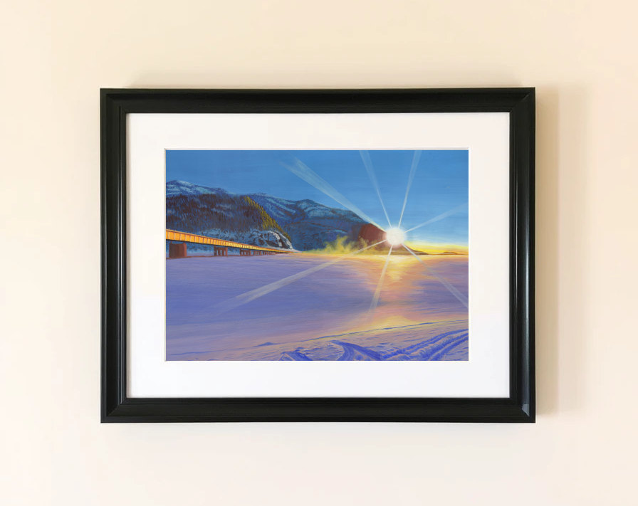
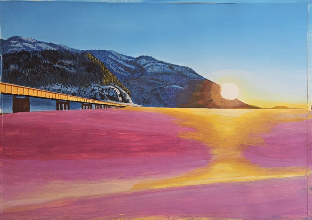
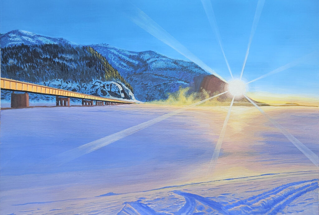
The scene itself was captured from the shores of the frozen Knik River many years ago. It features the bridge across the Knik River on the left, the frozen, snow-covered river in the foreground and the setting sun against a darkening blue sky in the background, with the rays of the sun reaching out as if it was an attempt to halt the impending evening. Tracks in the foreground hint at recent human presence. Although I can’t remember the circumstances, it’s likely that the sunset itself enticed us to exit at Reflections Lake, either on the way home from Anchorage or on the way to Anchorage. The photos from that evening became the foundation for this painting.
The painting itself is A3 size, about 11.7″ x 16.5″. I used Arches hot pressed paper (my favorite) for this painting and a mix of Holbein, Daniel Smith and M. Graham gouache to paint.
Creating The Painting
The reason I went with a larger size than the typical 8×10 or 9×12 inch paintings that I do is because I felt the vast open space warranted a larger size to properly capture the whole scene. Had I known about the challenges I would encounter a few hours into this painting, I might have used an 6×8 instead. Instead, I started with the sky, achieving almost the perfect gradient and color to fit an evening sunset.
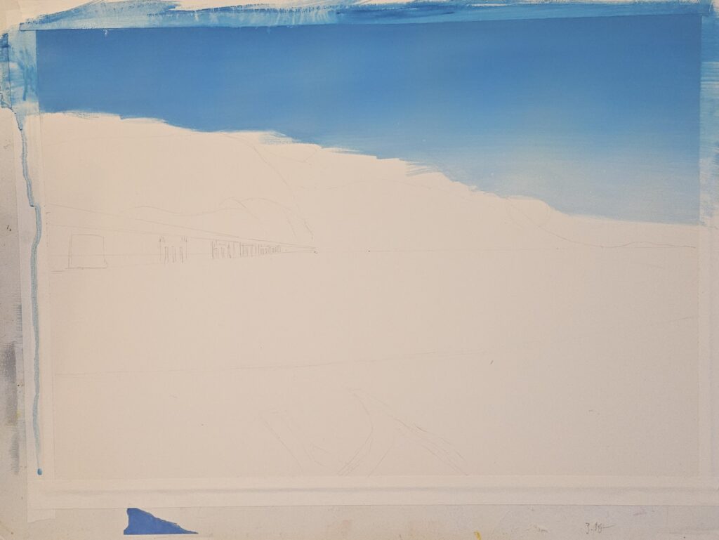
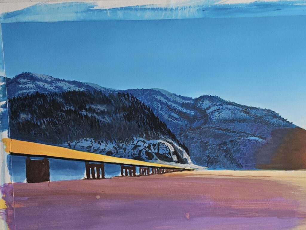
I moved on to the mountains in the background, blocking in the general shapes of the ridges as well as leaving space for the bridge itself.
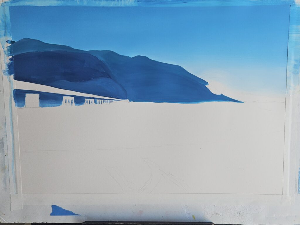
From there, I worked on the details of the mountains and also put the first touches on the bridge. Then, I added yellow underpaint on the bottom half using acrylic gouache. By doing this, the background ends up with a warmer tone while not reactivating with regular gouache while the yellow also shines through in places, creating reflections without having to paint them.
Then, it was time to start exploring the color if the snow.
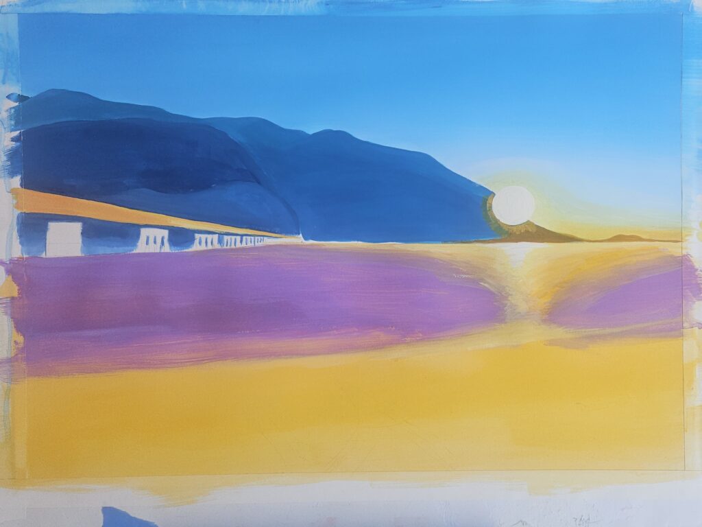
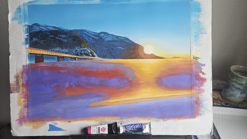
As you can see below, my first attempt ended up looking more purple than blue. After the first full pass, it felt like the snow needed to be a bit warmer, so I moved to a more reddish color, attempting to layer this on top of the prior layer.
This is where the trouble with the snow really started. Although acrylic gouache doesn’t reactivate, the purple layer was regular gouache. It activates fairly easily, depending on how much water you have on your brush and the mix on your brush. This mean I had to use very little water and quite a bit of paint to cover the areas I wanted redone. It wasn’t a pretty process on a large area like this.
After struggling with the snow for a while, I moved on to details in the background as well as the bridge. At that point, it was more about leaving the catastrophic snow color alone for a bit and focus on other areas where I would actually make some progress. As you can see below, the mountains in the background and the details from the background all the way to the cliffs right by the bridge are taking shape at this point.
But then, invariably, it was time to return to the snow and attempt to find some sort of resolution.
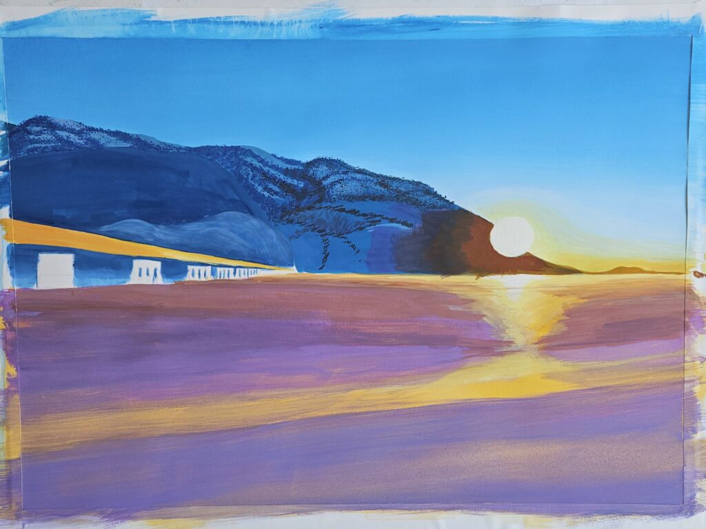
Before I moved on to the next color, I actually ended up painting over everything with yellow acrylic paint again in an attempt to prevent mixing with my other two failed layers. As you can see below, my next attempt ended up way too pink and red, way off from what I wanted. It was only at this point that I finally nailed the color I was looking for and methodically covered up the red and pinks with what to me looked more like snow.
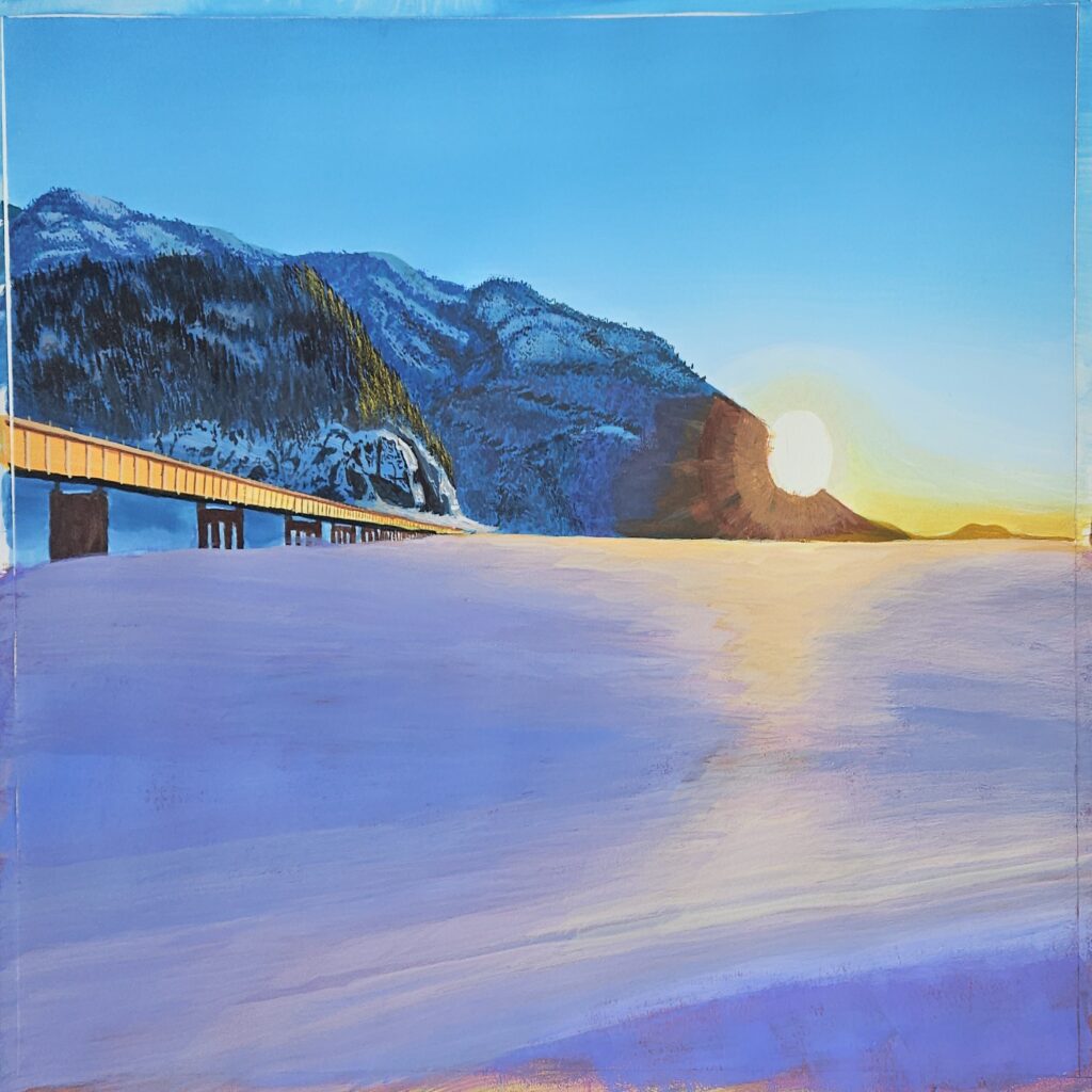
And jackpot! After countless hours of failed attempts and mixing errors I was finally able to produce the snow I had been looking for!
Next, I switched my attention to the foreground. The tracks were relatively easy after my battle with the snow and came out about how I wanted them to.
After tweaking a variety of details on and around the bridge, adding hints of fog and actually completely repainting the sky, the rays of the sun was the final touch on this painting.
Although it can be easy to keep to what’s safe and comfortable, it’s through challenges that one grows and becomes better. While there were many challenges with this painting, there are now quite a few new things that I’m more comfortable with that in the long run will make my upcoming art much better.
Prints (and soon the original) are available to buy right here on the website, if you’re interested in your own copy. Just click the button below!